Good Turn (Android)
in
After a few months of code-doodling the Good Turn that I developed way back in 2010 on iOS is now available on Android! The app is a complete rewrite in Java using Google Firebase for the data back-end. This version has actually been in development since 2010 after the iOS version was released, I just never got it to a state where I felt it was releasable until now.


The app itself is a native Java application written using Android design guidelines so that it will not just feel like an Android app, it is an Android app. The back-end uses Google Firebase to enable both a local offline data-store and real-time synchronization with other users of the iOS app, the Android app, and the app’s website.
App Design
While most of the code was relatively straightforward, My difficulty was sorting out what the app should look like. I wanted to use the most current Android design standards and widgets. However, figuring out what those were was tricky. Should I use TabBar or NavigationPanel, what should be an Activity and what should be a Fragment? These all puzzled me for some time, complicated by my taking years off from the project and those pesky Google folks continuing to develop their platform with new widgets and design patterns. For example, the original Good Turn uses a tab bar for its main interface. Android had this widget a few years/versions back, then did away with it, and now has put it back in.
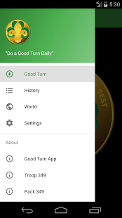
 Ultimately, I chose the left-side slide in navigation panel (from a
hamburger menu) which seems to be the current (dominant) interface.
I chose this based on a purely unscientific look at several recent Google apps.
They all just seemed to use some form of this interface. So goodbye
tab bar.
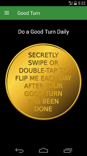
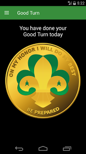
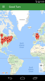
The Choice between Activity and Fragment was another mind-bender for me. The coin-flipping screen, the list of turns you have done, and the map of all turns are all Fragments of one main activity. Viewing a single turn’s details, from the list of all turns launches a turn-detail activity. This one made sense to me as something you might do from outside the app. For instance if someone shared a turn with you via text message or email. This leaves the settings and about screens as separate activities. In reality the about screens are all the same activity with different content.
Data Storage
Once the design was determined and the overall structure of the app laid out, the internal database and sharing of good turns was the next major hurdle. While here I write it as a sequential process, in reality I went back-and-fourth on the design several times. The iOS Version uses CoreData which posts to a Google App Engine server with a REST protocol. The back-end would work fine for the Android version but CoreData is not available on Android.
In the beginning (years ago) I started developing the app with SQLite. At the time, it seemed like a comparable database to the iOS version. I could reuse some of the REST code from the iOS version and post to the same Google App Engine service.
When I came back to the project I took a step back to look at what was going on. Through working with students over the years, I knew there were several databases as services on the market. Using one of these might significantly reduce the amount of code I needed to write. And they were more likely to be correct and secure. I wanted one that would be available when offline (scouts are often out where there is no Internet) and also handle the synchronization with a server. The server needed to keep both public (shared) and private (unshared) turns.
Google Firebase provided many of these features and, like many Google products, has a “free” tier for usage. I also looked at CouchDB, Amazon DynamoDB, and Couchbase. All of these look like viable alternatives. The thing that Firebase provided over the alternatives was a library that would connect to list views on Android and iOS. It took a bit of fiddling and learning on my part (the documentation is a bit scattered) to get Firebase working, but once I did, it was a boon to my development. Also, the GoodTurn app, for all it’s merits is unlikely to grow outside of anyone’s free tier.
Deploy
With any app, after the design, development, and sorting out of the million choices, comes the deployment or publication. It sounds easy, but there is another million choices, images, keywords, and details that need to be sorted out when you publish to an app store. Both Google and Apple try to make this easy with their store interfaces, but the myriad of details are a project in themselves.
It’s good to get to this point. The app is out. It’s on both iOS and Android. Go out an do a good turn today.

