Mobile Prototyping with Paper
in
Drawing on paper tends to be the fastet way for me to work on ideas. It works well when working alone or with others. The speed of pencil on paper is simply unmatched with digital forms. The downside is that the paper is not as easily shared with others and it takes a little more time to become digital.
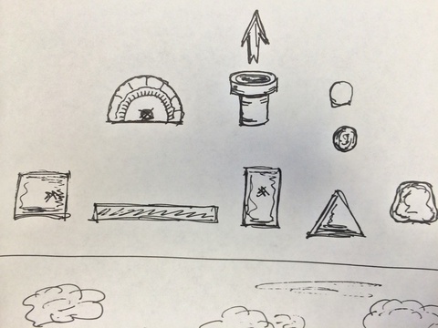
Using paper for design was in part an idea for an application that I had
not too long ago. As happens, one day I found myself doodling on my
notepad. This time however the doodles had a purpose. They were the
components of an angry birds style physics game that was swimming around
in my head: Angry Drawings. In the game you shoot a small sphere at a
stacked up set of geometric shapes that you have drawn. My current set
of doodles included the target shapes, the sphere, and a simple
background. The epiphany was to simply photograph the doodle with my
phone, bring that into a photo editing software, slice the image up, and
then plop it into a simple game engine, then viola! Game On. 
Back to this week; I had a few meetings with folks about developing mobile applications for a few target audiences and purposes. I went looking for what prototyping tools where available that a moderately computer savvy end user might be able to use to spec out what they were hoping for. Something I could point them towards to better flesh out their ideas. After looking at a few computer and device based solutions, I came across POP - Prototyping on Paper (free on iOS and Android). I was happily surprised at it’s paper-based approach.
POP allows you to work much the way I had done with Angry Drawings. You draw out your interface on paper, take a snapshot, attach actions to areas on the screen, and then simulate your idea. Viola! Demo On. It’s a brilliant method of getting an idea on paper to an interactive prototype. Additionally, anything you can draw, sketch or highly detailed, you can incorporate into your simulation quickly and easily. So easily, any moderately savvy end user should be able to mock up their ideas with ease.
Of course with POP you can also share prototypes with others. You also have the ability to gather their feedback through the app. When working with others who may be remote or just want to be able to demonstrate the idea, this is are incredibly useful features. They allow you to give out a working demo to your partners, customers or communities. They can instantly understand what the app is trying to do and how your design intends to do it. It makes super fast idea to deployable prototypes possible.
POP is not the only method of this low-friction prototype approach. PowerPoint and Keynote have been my long-time standby recommendations for building prototypes with a low learning curve and low cost of entry. Presentation software, like these, are ubiquitous and provide a very flexible stack of slides that you drop screen shots, images, and simple mock-ups into. Making sections of the screen clickable and able to transition to another slide in the deck is simple and approachable. It’s a short step for the masses that already make presentations for other purposes. Making them look like a mobile device is perhaps the most difficult task.
Also, Pixel Press has been working, for some time, on their paper-based game design software. However their Kickstarter project and progress have yet to make it out to the public. Their latest projection is to release on iOS in Spring 2014. I’ll believe it when I see it. Until then, it feels like a lot of marketing and vapor-ware.
In the end, I don’t expect POP to replace PowerPoint or Keynote as my recommendation for others, but for myself, I think it will be a boon in fleshing out if an application is worth making by playing it out a little more than you can with paper only. It will save me time mocking up in Xcode, only to determine the flow is wrong. And, it will allow me to doodle more.
Updates
April 7, 2014: It’s actually a bit tricky to get POP to take good pictures of the paper prototypes. The color and angle are often slightly off on the different screens. This makes each screen look different. Also having a tab bar on each screen means you have to redraw it each time, on each paper prototype. This suffers as the tab bar drawing is in a slightly different place on each screen. The slight adjustment is quite annoying when demo-ing the app. These are not no-go problems, but quirky enough to make it not as fun.